

RUN ON (CISCO CLOUD) - BUILDING THE FUTURE OF CLOUD.
PROJECT OVERVIEW
Cisco is the worldwide leader in IT, networking, and cyber security solutions and is now building a next generation cloud infrastructure tool for Cisco internal users.
RunOn is the one place (home ) to find, learn, choose and run cloud infrastructure.
Role and Responsibility : I was responsible for the experience strategy and redesign of the entire application. I lead the UX and Visual work, producing all major deliverables.
As the lead designer of this product, | led a team of 2 other designers and worked closely with 3 product managers, 1 project manager, and 6 engineers.
UX Deliverables:
Journey Maps
Personas
Information Architecture
User Flow Diagrams
Conceptual designs, mocks, and wireframes
Pixel-perfect visual designs and specs
Tools: Paper, Pencil, Apple Keynote, Sketch, Invison, Zeplin, and Adobe Illustrator
Design PROCESS
Business Problem
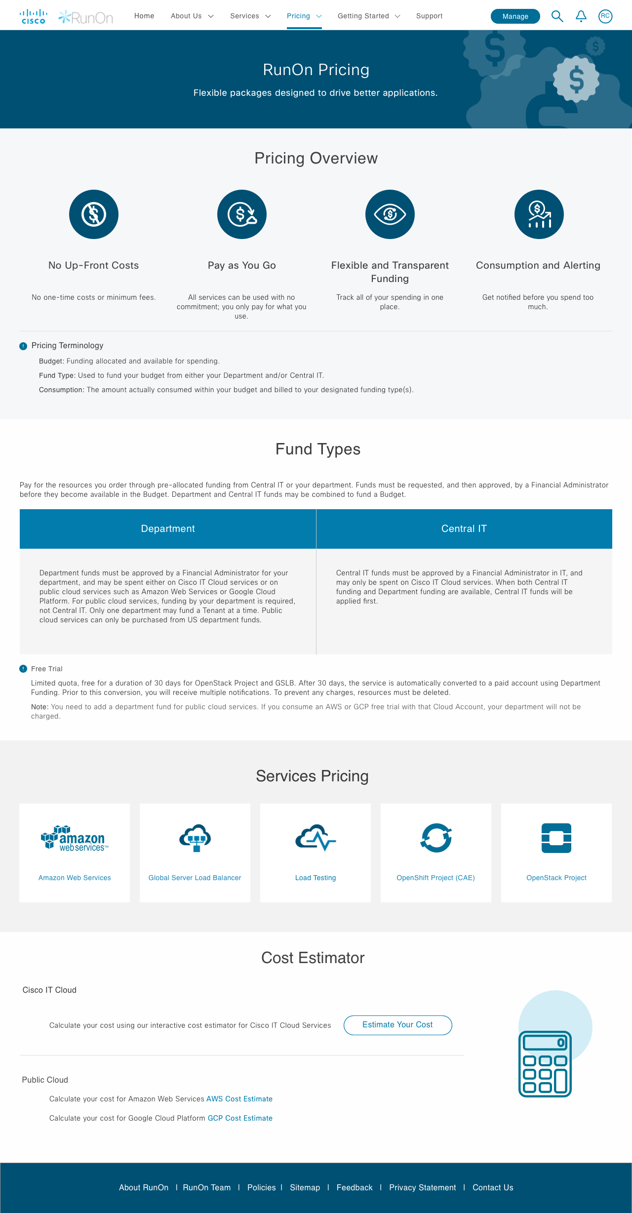
It’s a scattered experience to order infrastructure services through RunOn. Businesses want to provide a one consistent view for users to come in and order infrastructure services.
Business Goal
Enhance user experience and making the product more intuitive and provide a fast, simple and secure infrastructure lifecycle experience through a single user interface.
One-stop shop for clients for Cloud and classic infrastructure services
End to end integrated offering from finding and learning to choosing and running
Pay-as-you-go model for service consumption
The Challenge
Remove friction in finding information
Simplify decision making
Need to align to Cisco UI Kit
It’s a scattered experience to order infrastructure services through Cisco. Businesses want to provide a one consistent view for clients to come in and order infrastructure services.
A consolidated single entry point for all the infrastructure needs and end to end management
Visibility of all the service offerings
Easy way to find a service by provider, by type, by category, etc.
Guide me to choose a service
Consistent Learning Contents
Help and Support for each service offering
Phase 1.Discovery (Problem Exploration)
As a UX designer, I want to get assurance from users that they will attend usability testing sessions so that my time and efforts are well utilized for redesign of UX deliverables as applicable. Conducted usability testing to find pain points and expectations
Stakeholder interviews:
I started with a kick-off meeting with stakeholders to discuss a project plan, and asked questions for deeper understanding of the project goal and vision.
After the initial discussion and review with RunOn stakeholders.
User interviews and Usability Testing:
Conducted 20 of IT and Non IT user interviews and noted all the pain points and observations.

User Interview Findings
The key takeaways from the user interviews were 75%, says homepage is confusing and difficult to understand the steps.
50% Users could not find or read information on the Home page.
Most of the Users couldn’t complete the task
User Can’t find quick access to learning / how to get started
The sections on the home page are unclear and don’t know where to begin
Unsure of where to learn in RunOn / how to get started
Unsure of all the products available in RunOn
Unsure of what RunOn Tenant Services and RunOn Marketplace is and how it fits into entire ecosystem
COMPETITIVE ANALYSIS
My goal is to compare and identify common features across these sites and potential opportunities for Data lab to differentiate itself. The most important takeaway from this activity was learning how different applications organized their selection and the overall layout they used for their products. This was helpful information that helped solidify the stage for my second phase of research.

Phase 2. Define (Problem Validation)
Discovery findings helped me to understand the user’s pain points, as well as I went through the existing UI, listed all UX problems it had to make sure that the redesign fixed every one of them.
User Journey Map
The Journey Map effectively pinpointed the Home Page and Onboarding shortcomings in meeting users’ expectations
Defined hierarchy and user interaction with user testing. As I went about understanding more from our users what they look for the product, I started to put together a system to help us understand the big picture. It was important for me to come up with a journey map to help explain all the stakeholders and have a shared understanding and vision of the product.

Persona
Personas helped in understanding and solving for patterns that are common across all IT and non IT professionals.
Information Architecture
Before touching upon aesthetics, steps navigating users must be revamped to shorten the process. So, Created improved and easy navigational steps for RunOn..

Phase 3. Ideation(Solution Exploration)
White Boarding and Brainstorming session
Brainstorming exercises with the design and product team. The goal of this session was to align the core team with the goals of the project and problems we were solving. As a group, we evaluated many ideas and potential solutions as possible.

Paper Sketches
Sketches are the best way I found quickly, easily, and comprehensively communicate design solutions with my team. It provided information almost immediately what needed to be fixed and which approach was correct. Sketches not only help me articulate how I plan to tackle a problem, but by thinking out loud on paper, it allows everyone, myself and my team to see how ideas begin, evolve, and finally crystallized into the solution we’ve all been working toward.

Phase 4.Design and Test (Solution Validation)
Wireframes and Prototypes
Created wireframe options for user testing and finalized with A B testing with the multiple users.


Hi-fi Mock-ups
After doing the multiple rounds of sketching for each user journey we as a team finalize the Visual Design.
High-fidelity mockups not only enhance details and visuals, but also integrate feedback collected from the previous sketches to provide greater improvements.


Implementation
Final Visual Design defined the interface style and guidelines for the feature, including standards for colors, typography, font size, margin, and padding. It also represents and capitalized on efficiencies while ensuring high standards of consistency, clarity, and elegance across all facets of the experience, so that the developers can easily implement them.

Phase 5. Test or Validation (Solution Scalabilty)
Usability Testing/Key Metrics
Now with new RunOn application user don't have to experience the frustration any more, they can come to RunOn.cisco.com for all of their cloud infrastructure needs and we provided a consistent and better experience across all of our services.
The post-implementation evaluation is now compared with the pre-evaluation of the platform to draw conclusion upon the redesign success and provide recommendations for further improvements.

As UX is a discipline to continuously meet users’ changing expectation, resolve pain points and add new features efficiently, some key recommendations inform on the next improvements.
