
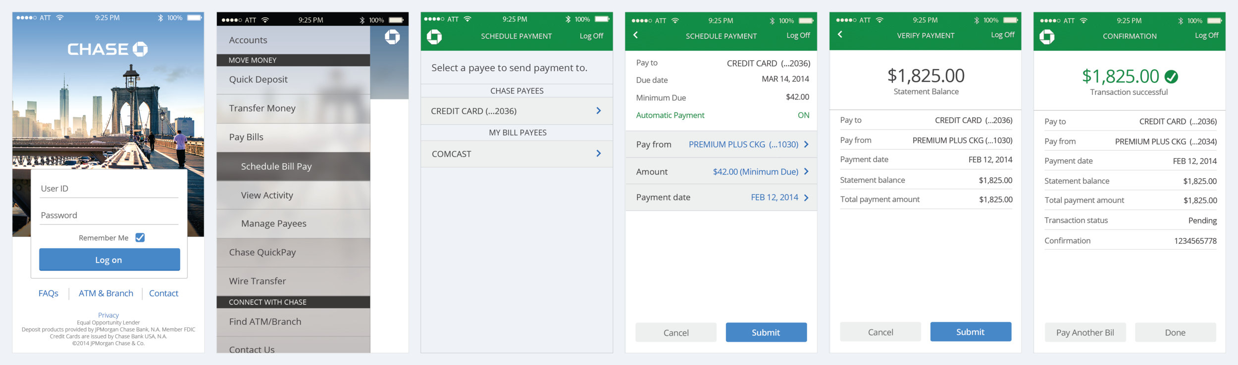
Online Payments
As part of the total redesign of the Chase.com site, the payments section was radically simplified so the user had the impression that making a payment was as easy as sending an email.
User Needs
Provide the user with simple and secure means to make their payments. The user must be able to quickly make a single payment or multiple payments from where ever they may be within the site. Lastly, the user should not feel overwhelmed by too many payment options as well as too many available related actions.
Business Needs
The new design had to accommodate the current set of payment products (Bill Pay, Chase QuickPay, Transfers and Wire Transfers) and to standardize the payment input forms across all the Chase account products (Credit cards, Mortgages, Auto loans, Home equity loans, etc.).
Solution: Each classic feature/functionality is mapped into categories (e.g. Site, page, flow, page component, etc.) and created task based flows.
Created site pages with optimized design consistency and minimized disjointed customer experience.
My Role
Managed the creation of the various design deliverables. Worked with the product team to define the business requirements, presented design work to senior stakeholders, as well as collaborating and provided feedback to the development team.
Final mock-ups
Bill Pay
To Do - Alerts

Send and Receive Money

Chase bank — Digital Banking Redesign
Project Overview
JPMorgan Chase created a Digital Customer Experience (DCE) group to redesign the desktop and mobile digital banking experience for Chase customers.
Problem
User needs: Users not able to find all the products on homepage and User wants the complete all other tasks with minimalistic approach.
Business needs: To maximize business by increasing user engagement via redesigning the platform. the minimal interface.
My Role: I was the lead designer working with product owners across all lines of business (Chase Home, checking, savings, payments, business banking, etc.) to design and execute reusable components to build out any web page a product would need…including the homepage of chase.com. I ideated, sketched, wireframed, designed, and created specs and guidelines for the system to show all the different components and how they would function
Solution: Each classic feature/functionality is mapped into categories (e.g. site, page, flow, page component, etc.) and created task based flows.
Created site pages with optimized design consistency and minimized disjointed customer experience.
Process

Experince MAp

Personas

I created five personas based on their needs-based clusters (archetypes) around mobile and financial preferences to inform design of mobile and tablet banking applications.
Through out research, I collected a wide range of information to inform the clusters/archetypes:
• Demographics: What are the defining attributes for the various respondents?
• Financial information: What is their current usage of various financial products?
• Technology adoption and banking channels: How do they currently use technology and the various banking channels and what are their perceptions of technology?
• Life stage: What is their current life stage and corresponding financial needs?
• Attitudes (max-diff): What are their attitudes around mobile and around finances?
• Concepts: What do they think of a few potential concepts banking tools?
User Needs

competitive audit

Card Sorting

information architecture

Ideation

Rapid Protyping

Wireframes

High Fedelity mockups

Chase Homepage
Based on customer feedback and business request, enhanced the user experience with existing design pattern to display the most commonly used actions and also promote other features at the same time.


Visual Components

usabilty testing

I managed few people to test the prototype that we created for testing. We got really amazing feedbacks from our tester. It was one of the best experiences while User-testing.
Takeaways

Digital Customer Experience
Our new Chase Personal Online (r1) offers the latest design principles for an improved customer experience and complements our
new Chase mobile apps. The site reflects four user-experience principles:
Simple
We’ve simplified the dashboard for the accounts, payments and profile so that customers can manage their Chase experience from
one location.
Personal
From the Chase.com homepage to the secure dashboard, customers will have a personalized experience. On the homepage, they’ll
see personalized content, stories and photography. Once they sign in, they’ll be greeted by name with useful messages about their
accounts with clear calls to action.
Human
We’ve also rewritten contextual help using natural language search. Customers can look for answers by just typing in a relevant term.
We present potential answers and display the one they’ve chosen on the same screen. The tone of all messages and instructions is
friendly and conversational.
Cohesive
The responsive design is appropriately adaptive across devices from desktop to tablet, so customers will have a familiar experience
regardless of how they access Chase.com.
Overall, our new Chase Online experience empowers our customers by offering easier account management, which will reduce call
center demand, and treats them personally, increasing their desire to recommend Chase to their friends (NPS).
This experience is also built on a new technical architecture that will ensure appropriate response time, resiliency and security for our
business, as well as enable faster future innovation.